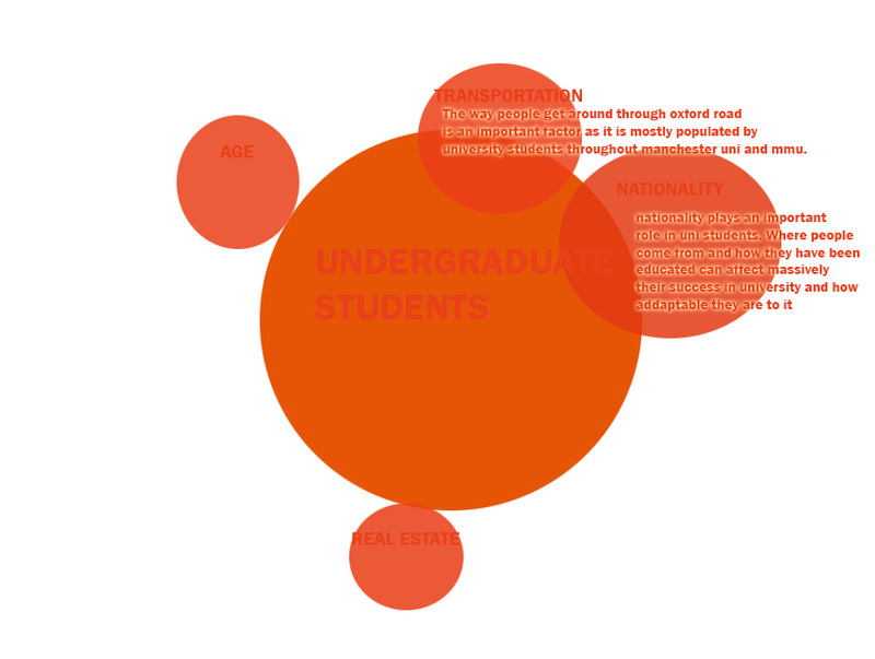
We made a diagram showing the relationship between our groups data (that of graduate's salary income) and with the other 4 groups to try and understand how that might link to the app.
Posted 14 May 2014 13:49
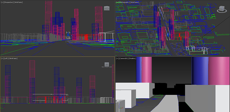
Importing our 3d Sketchup model into 3ds Max to make a video of the ocford road strip with our mapping. The diagrams represent the gender ratio of the courses in within both universities.
Posted 14 May 2014 13:45
We gathered data of all the other groups into one to be able to figure out how all of them may link to each other. Next step is trying to visualize them working all together on the app.
Posted 12 May 2014 14:51
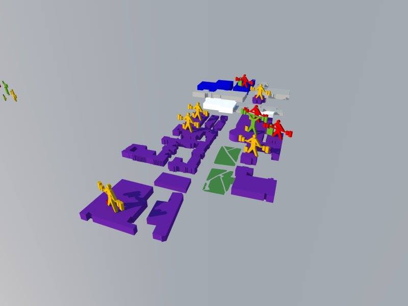
first attempt on creating a 3d visual mapping diagram for part of our data collection. The green person symbolized a percentage of over 95% of students who continue studies in every department of the university of mancehster. The red is a percentage below 90%. The bags aside these icons symbolize their employment rate after graduating.
Posted 12 May 2014 11:04
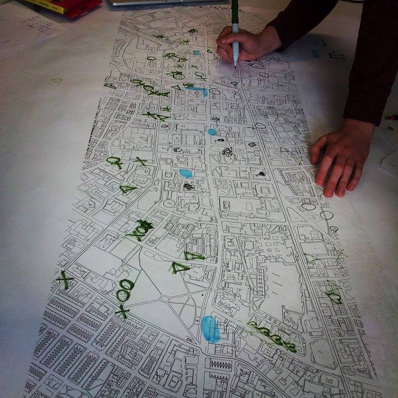
creating personalized icons inspired from the 'Noun Project' to create a map to symbolize the continuation of course within universities along oxford road.
Posted 12 May 2014 11:00
Ulysses Sengupta's lecture was very interesting. Learnt about the differant types of mapping and how that can affect the way you end up designing.The invisible factors in within a map are very important aswel and could always be usefull when understanding how the city works0
Posted 7 May 2014 14:43