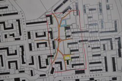
The map of the site shows some of our initial thoughts and ideas towards the site. Indicating some of the ideas, the map shows: the idea for botanical cladding along fences and houses that do not overlook the site, a 'yellow brick road' concept whereby altering the pathway and unifying the site then it will attract more residents to the site and seating spaces that allow for social interaction.
Posted 16 May 2014 15:19
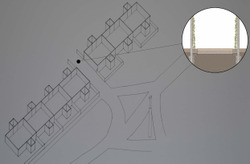
The axonometric focuses on a subdivision of the site, it shows the relationship between one of the alleyway/entrances to the site. The intention behind the design was to make a friendlier, more aesthetically pleasing passage between the residential section and the site.
Posted 16 May 2014 14:15
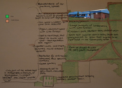
It helped to create a 'Rothuizen' style image in order to analyse the site in a way in which bought together the experience from the site along with possibilities and limitations. It is focussed more on the community centre and the area surrounding as the space is the most thought about in the community.
Posted 8 May 2014 21:27
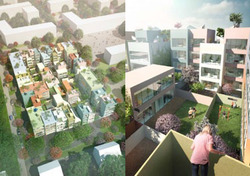
After visiting the site, some analysis and research was necessary to help understand the site and the possibilities it holds. The Urban Hybrid Housing Project is one that looks at cheap housing that focusses on pedestrianised areas with green spaces while also being affordable.
Posted 8 May 2014 21:25
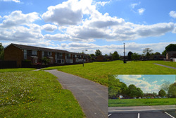
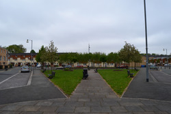
Sale West features an abundance of large landscaping areas with little to no functionality and a plethora of car parks that exceed the number spaces needed to facilitate the needs of the inhabitants. The area desperately needs some intervention to help provide some necessary functionality to the vast space they have.
Posted 8 May 2014 18:59
When questioning the principles that form a good neighbourhood, the idea of a centralised location lends itself well into the argument. Grove Village, although relatively small, seems to have incorporated this idea well in the community.
Posted 8 May 2014 18:34
