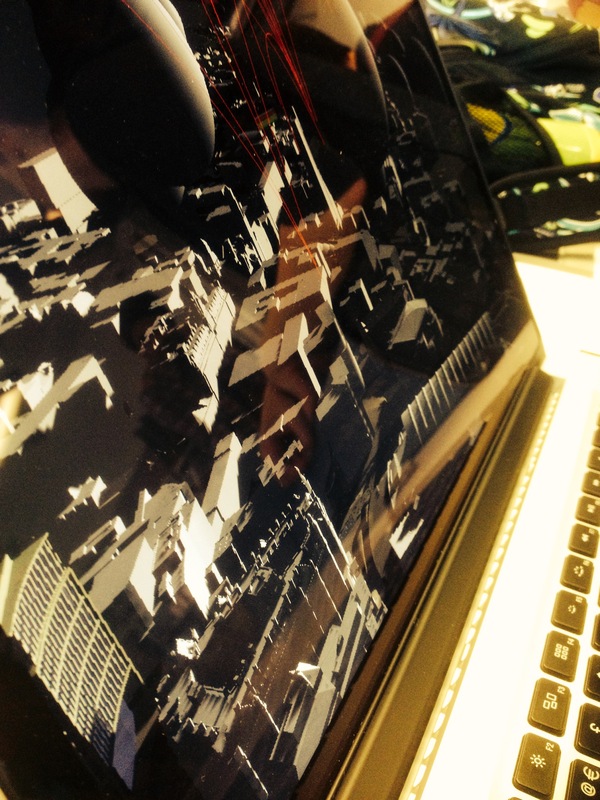
09: Output - Using Arup's model of oxford road and the combination of C++ programming and each teams research a 3D visualisation was accomplished of our data
Posted 16 May 2014 23:50
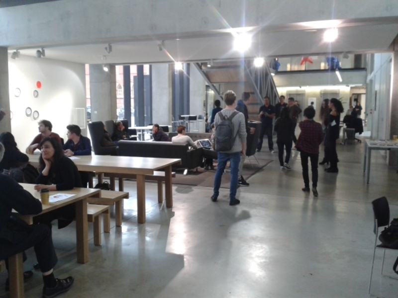
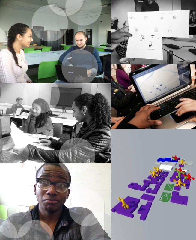
08: Teamwork
Posted 16 May 2014 23:46
Finish Product - The Data App - Manchester Oxford Road
Posted 16 May 2014 21:40
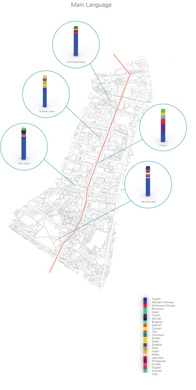
A final visualization of the main languages spoken by people on Oxford Road.
Posted 16 May 2014 19:51
16/05/2014
App screenshot.
Posted 16 May 2014 19:27
16/05/2014
App screenshot.
Posted 16 May 2014 19:25
16/05/2014
App screenshot.
Posted 16 May 2014 19:24
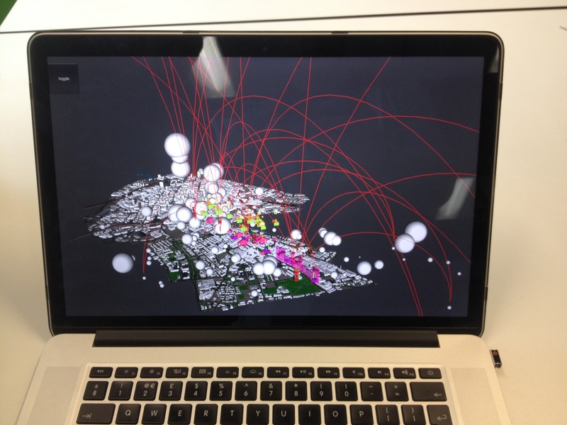
Final app with data layered.
Posted 16 May 2014 19:17
Testing final app.
Posted 16 May 2014 19:06
Testing skills by creating simple game with GameSalad.
Posted 16 May 2014 19:05
Testing the rules of an interactive physical game.
Posted 16 May 2014 19:02
Visualized data. Nationalities on Oxford road.
Posted 16 May 2014 19:01
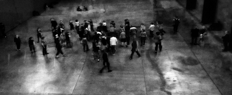
Collecting primary data on Oxford Road. First suggestions of visualization.
Posted 16 May 2014 18:59
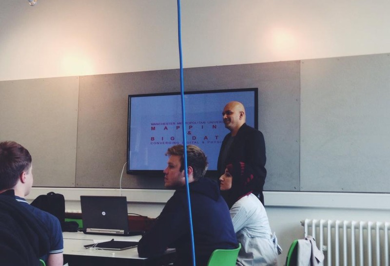
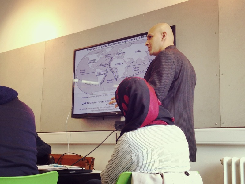
"Mapping-identifying relationships". Lecture about mapping and data collection by Ulysses Sengupta.
Posted 16 May 2014 18:56
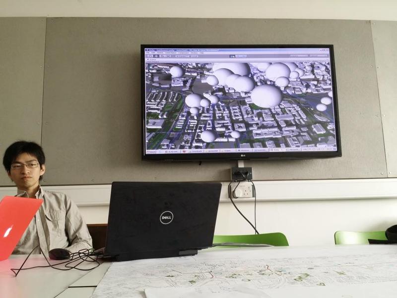
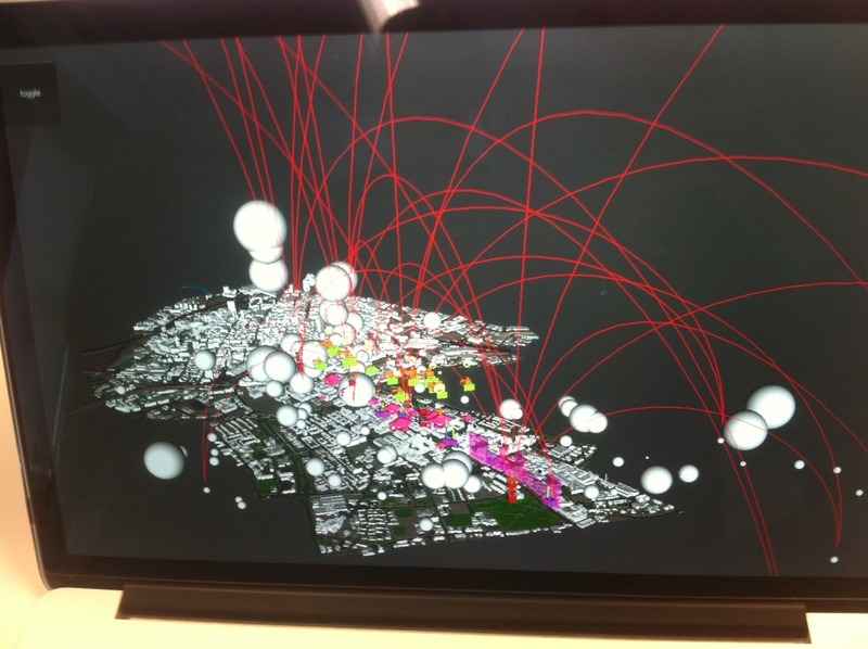
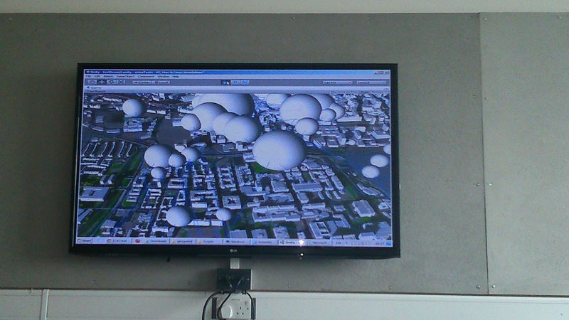
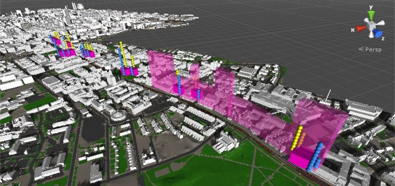
After supplying Eric with our data (property pricing) the pervious day, we had the first visual of the final application the next day with the data represented in 3d- images. Different sizes of spheres on the image represents different property worth.
Posted 16 May 2014 17:00
12/05/14
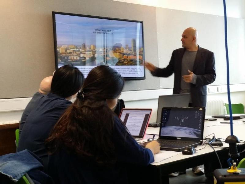
Eric, our collaborator from Arup, showing us some projects.
Posted 16 May 2014 16:46
Our app is finally done!!! Today we could play around with the app that includes all the information that we have gathered over the past few days. So exciting and interesting !!
Posted 16 May 2014 16:41
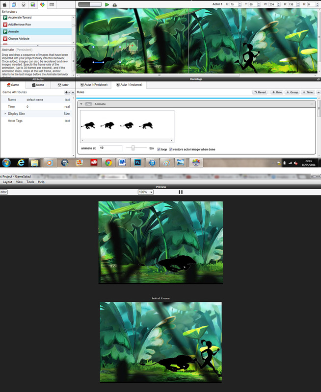
Today we learned how to use Salad Game, which allows you to create simple games in a very easy way. The idea was to explore new programs and ideas that will be useful in the future. It helped us understand the process of making an app and how to apply rules with the "If...Else" method.
Posted 16 May 2014 16:40
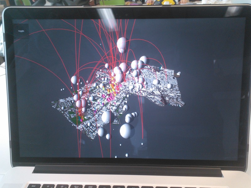
All of the data we have been gathering, compiled together in the app
Posted 16 May 2014 16:14
Running the app. Hip Hip Horray!
Posted 16 May 2014 16:13
Playing with final app on last day.
Posted 16 May 2014 14:46
Final app completed:
Posted 16 May 2014 14:17
Session 7 // The App
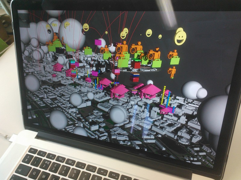
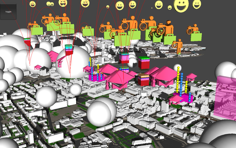
This is how the final Data City App looks after coding from the fifth years and collaborator Eric. It ties together all of the data the five subgroups collected and transforms it from the raw data exhibited in the spreadsheets to produce a visual output overlaid on top of the Manchester City Centre Model from ARUP.
Posted 16 May 2014 13:47
First view of the app with icons and animations.
Posted 16 May 2014 11:56
Introduction to game making website " Game Salad". The website allows users to make simple games using the "If Else" rules.
Posted 16 May 2014 11:53
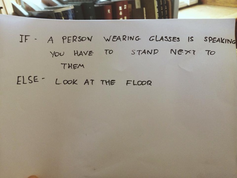
Day 6 - Introduction to "System Dynamics. The main aim of the session was to introduce the group to the basics behind game design. We had to individually come up with an "If Else" statement for another person. This statement basically meant "If" a certain thing happens an action should be made, "Else" if a certain action should be made till there is an "If". This activity took place in the cafe.
My "If Else" statement -
"If" - A person wearing glasses talks you have to walk over and stand next to them.
"Else" - Walk around looking at the floor.
Posted 16 May 2014 11:50
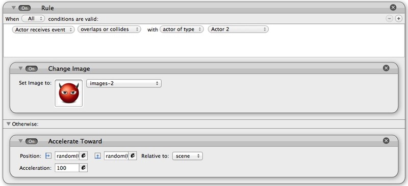
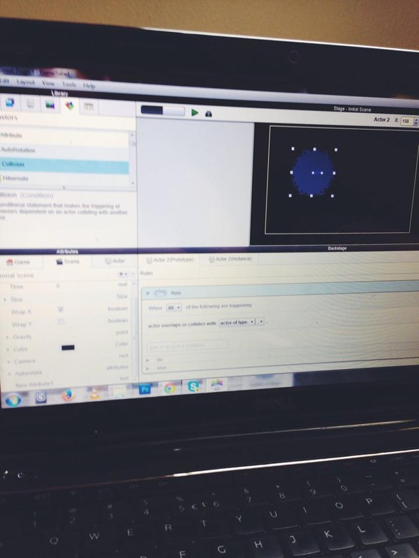
Session 6 // The 'If Else' Statement
The result that the 'If Else' statement has is the one depicted above. As soon as Actor 1 collides or overlaps with Actor 2, its image changes to an icon of the devil. It then continues to move randomly around the screen.
The process of creating a basic game therefore gave a better understanding behind 'System Dynamics' and how this could be potentially translated to the Data City app.
Posted 16 May 2014 10:28
Session 6 // The 'If Else' Statement
After understanding the logic of the 'If Else' statement in session five, the sixth taught session saw the group exploit the statement in GameSalad.
GameSalad is a basic program that allows you to create a game or animation based upon a series of rules. By creating two actors we can see the effects that the rules have. The statement therefore reads:
If Actor 1 overlaps or collides with Actor 2, then change the image to an icon of a devil.
Otherwise, move randomly around the screen at an acceleration rate of 100.
Posted 16 May 2014 10:25
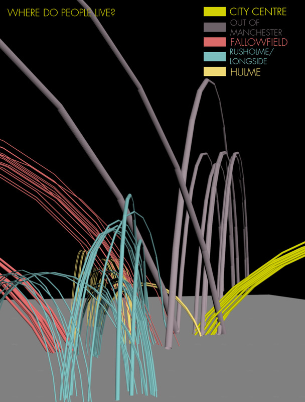
Map showing the places where people live and how how far they live from where they study or work
Posted 16 May 2014 02:25
First test of the application. We are all excited to see the final result
Posted 16 May 2014 02:13
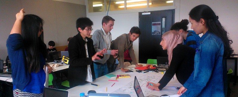
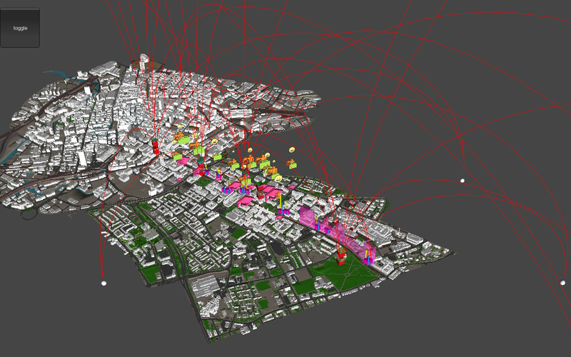
Discussing the data and how it is going to be put together for the app developing
Posted 16 May 2014 02:11
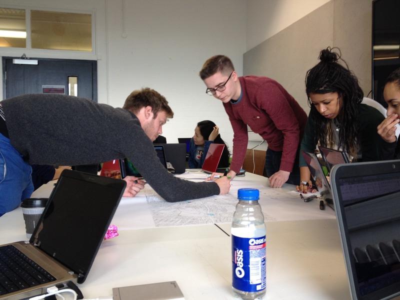
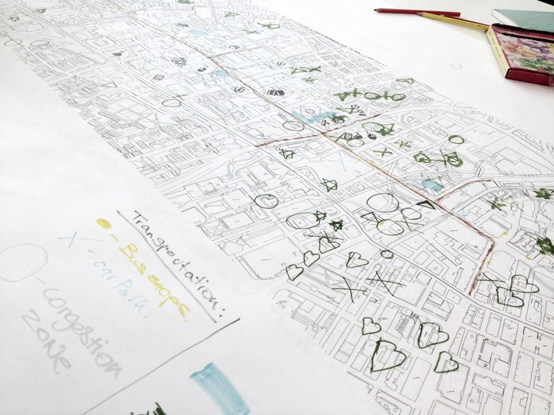
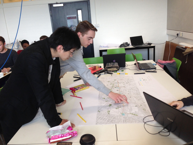
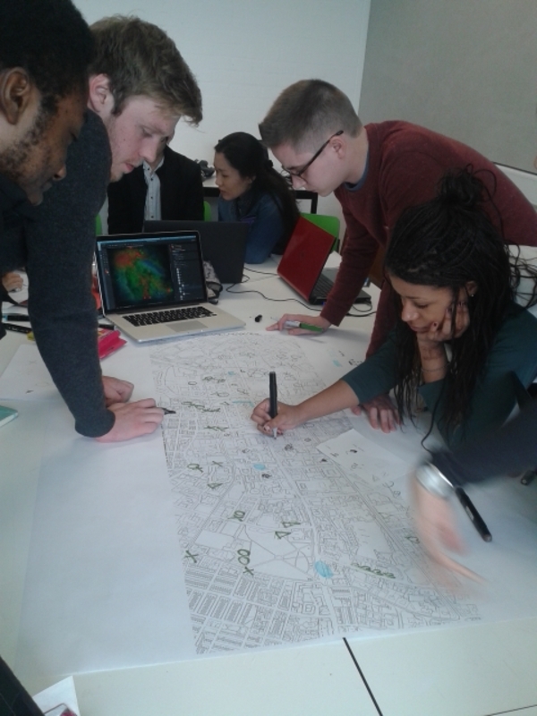
Physically mapping the data each group has gathered through their research
Posted 16 May 2014 02:08
07: Development of our ideas - Our team formed a walkthrough of Oxford road to understand how are data could be experienced by the user.
Having gained our own data we then drew comparisons and relationships between the other groups data and displayed it on a map of oxford road.
Posted 16 May 2014 01:16
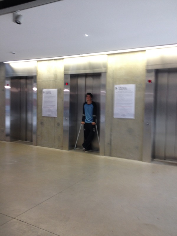
Session 5 // System Dynamics and a Social Experiment
Ulysses began the fifth taught session by introducing the group to 'System Dynamics'. The idea behind this session was for the group to understand basic idea of how games work and in particular the 'If Else' statement.
Each of us was to therefore come up with an 'If Else' statement which would be passed onto the person sat to our right. I gave Toby:
If there's no one stood waiting for a lift in Chatham, go up and press the button and wait in the lobby.
Else, stand on the doorway to the lift and stay there, not letting anybody past.
As a result, there were a few confused people waiting to use the lift as Toby just stood there. This social experiment therefore gave us a basic understanding of 'System Dynamics' and the 'If Else' statement.
Posted 15 May 2014 21:03
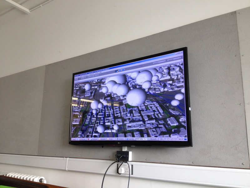
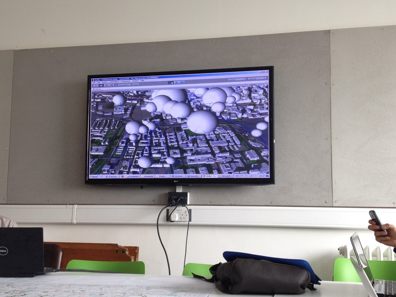
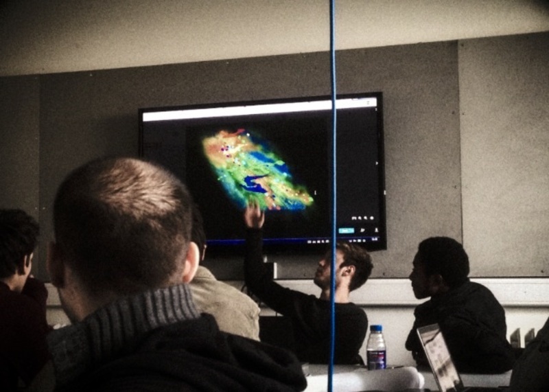
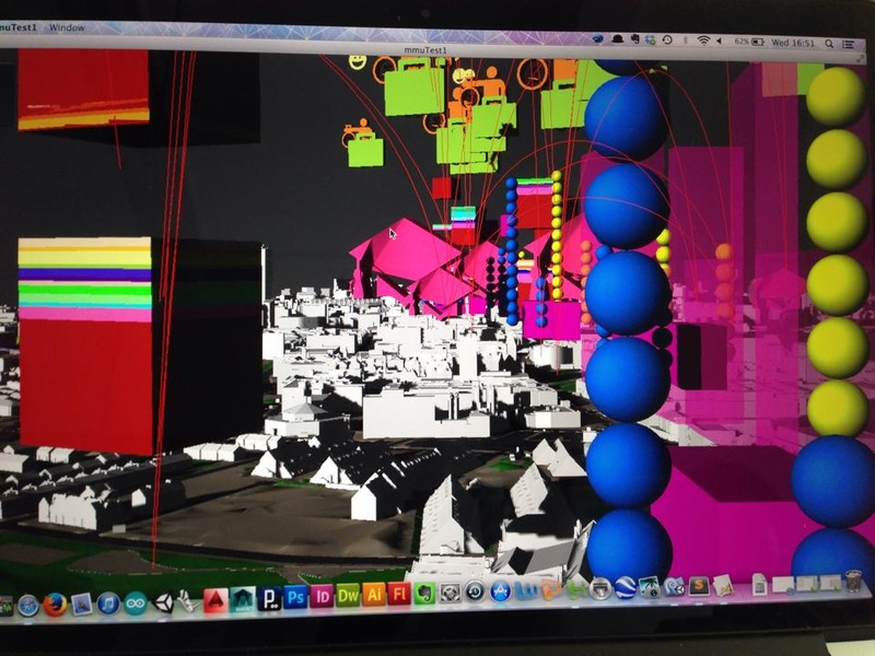
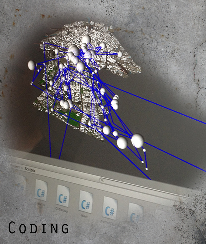
Session 5 // An Early Visualisation
The group gathered for the fifth session with Eric showing an early visualisation of how the property price data has been coded into ARUPs Manchester City Centre Model. By exploiting the longitudinal and latitudinal information linked to each individual piece of collected data, spheres have been created to denote the data with blue lines showing its connection to the rest of the collected data.
This therefore allowed us to see how our collected data can be extracted from the numbers in spreadsheets to create the visualisations for the Data City app.
Posted 15 May 2014 20:52
Session 4 // Extracting the Data
In order for the app to be created, Eric asked for each electoral ward to be separated and created into its own GOOGLE SketchUp file. The purpose of this was to create a mesh for the data to be layered onto during the coding process.
Posted 15 May 2014 20:46
Session 4 // Overlapping the Data
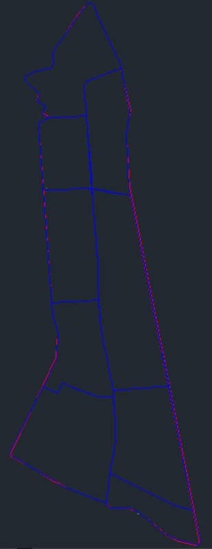
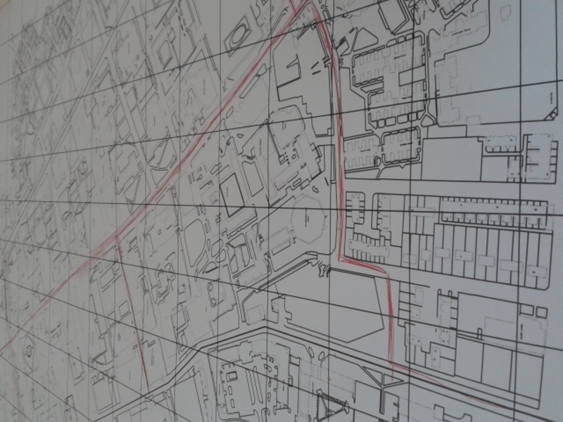
After meeting Eric Cheung, another collaborator of the Data City project, the entire group began the process of layering all of our collected data onto a 2D map of the Oxford Road Corridor.
By doing this, the group were able to see any overlaps in data and how they could be potentially linked with one another. The 2D version also allowed for Eric to talk to the five individual groups in order to understand the research we'd gathered and the methodology for its collection.
Posted 15 May 2014 20:36
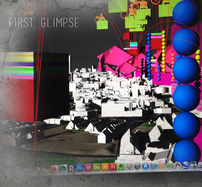
First glimpse of the app.
Posted 15 May 2014 18:49
A brief look at the app in development with property prices mapped onto the Manchester city model from Arup.
In this session we participated in a series of experiments to understand the concepts of gamification and game design. Specifically we played a game where we each received a rule that reacts to the physical environment around us using the if/else statement.
Posted 15 May 2014 14:40
To being to put our data sets into a single app/game, each group mapped the geolocations of our data onto a single map so that we can see where they overlapped, or where correlations or links might occur.
Posted 15 May 2014 14:31
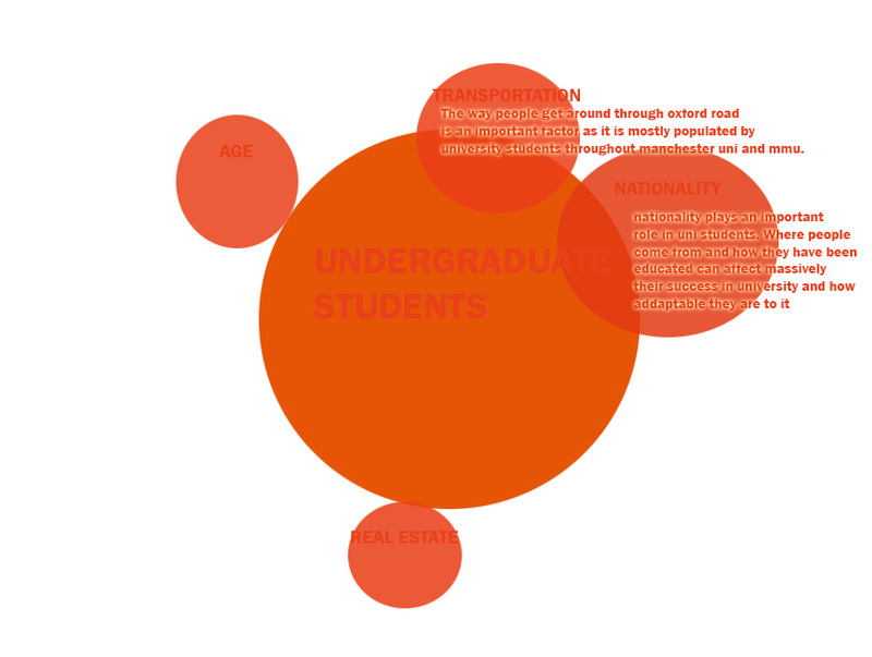
Since data obtained from the census was secondary (thus unreliable), my group went out and gathered primary data from within Oxford Road.
In order to make comparisons with our data, we selected several locations spread across the length of the Oxford Road corridor and interviewed a total of 250 people. Some of the questions we devised were so that we could obtain data not included in the census - e.g. their area of residence in Manchester. This would allow us to link our data to locations outside of the corridor. Above shows the data of 'other languages spoken' mapped as a percentage bar chart at their specific location.
We also managed to get a set of data on the nationalities of students in the University of Manchester, but these were omitted later on as they were secondary.
Posted 15 May 2014 14:17
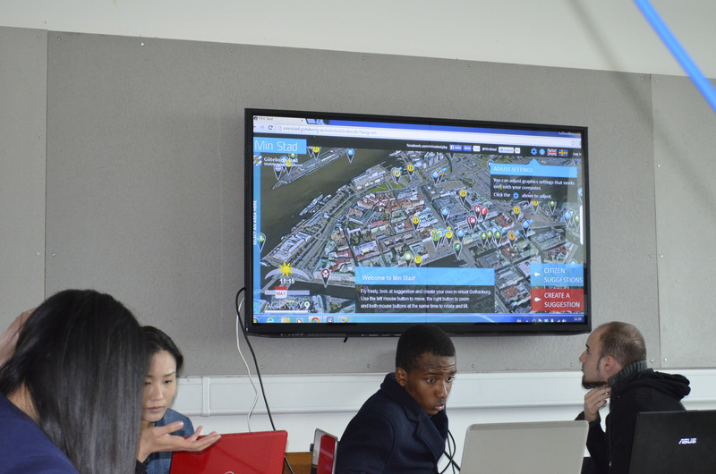
In the second session Ulysses gave us a brief presentation on the spatialization of data i.e. mapping and the consequences of this on design. Different methods of mapping data such as Nolli maps, mindmaps and etc are introduced.
Posted 15 May 2014 14:06
First View of the app with animation and icons...
Posted 15 May 2014 12:14
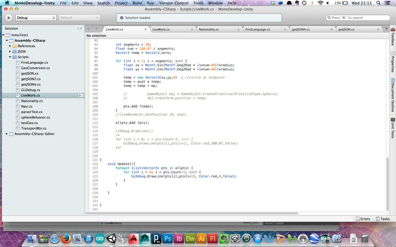
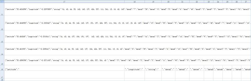
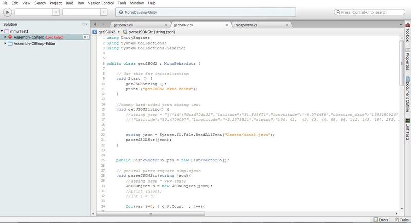
Using EXCEL to translate the list of numbers into C# language
Posted 14 May 2014 22:45
Scripting part of transferring the original data
Posted 14 May 2014 22:44
Use a button to control the appearance of the data layer
Posted 14 May 2014 22:43
Mapping the data of transport along the oxford road
Posted 14 May 2014 22:36
06: Game and Programming exploration - having been introduced to a game development programme today I developed my own 2D 'Temple Run' which put into consideration the concepts previously learnt like that of the 'If' statement and new ideas like 'interaction' and 'animation'.
Posted 14 May 2014 22:12
Geolocated information
Posted 14 May 2014 21:58
Zoomed in app.
Posted 14 May 2014 21:38
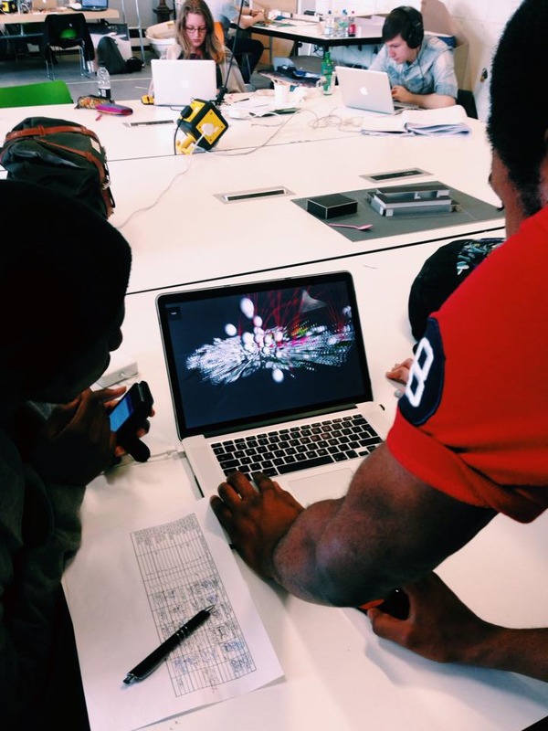
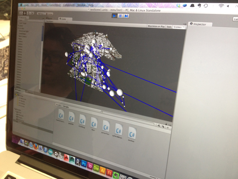
Testing the visual output of the scripts.
Posted 14 May 2014 21:37
Eric Cheung aka Neo has been collaborating with the group not only for scripting but explaining system dynamics and urban data.
Posted 14 May 2014 21:36
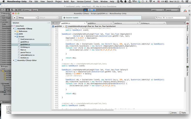
Working on scripts for each research group within unity - learning to use C# in the process.
Posted 14 May 2014 21:31
Had to convert the collected information into readable data for the game engine scripts.
Posted 14 May 2014 21:28
05: If and Else experiment - Local rules are not independent. Through interactive experiments it was understood that there are a number of external components that influence such scripts (when applied to real life scenarios).
Posted 14 May 2014 20:14
12/05/2014
Another method of representing the data collected in 3d using Photoshop and Sketchup.
Posted 14 May 2014 16:47
C# code translating value of object to volume size and colour categories.
Posted 14 May 2014 16:29
08/06/2014
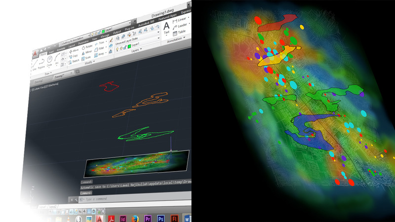
Making the heat map in 3d would make it more visually appealing .Tracing out the outline of the heat map to see how the contours could be generated and then merged together with the heat map to give a final image.
Posted 14 May 2014 16:14
Original 3d mapping for university based data set. Including continuation, employment, average income and satisfaction of courses in UoM and MMU.
Posted 14 May 2014 16:12
Game design in process. Size of each icons indicates the variation value of continuation, employment, average income and satisfaction of courses in UoM and MMU.
Posted 14 May 2014 16:07
07/06/2014
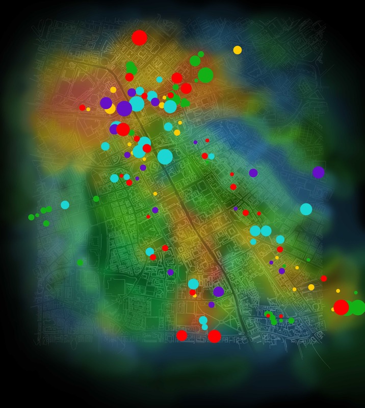
This is a representation of properties (the dots) overlaid with a heat map showing wealth along the corridor. The size of the dot represents the property worth, and the colour of the dot represents the year it was sold.
Posted 14 May 2014 15:58
05/06/2014
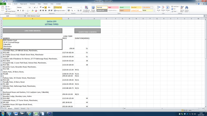
My group was focusing on property pricing in real estate. I was handling letting types. I gathered data and now transferring them into excel sheets.
Posted 14 May 2014 15:38
05/06/2014
The first session was mainly introductions. Ulysses Sengupta gave a lecture on the concept of mapping and big data. We were then split into groups and asked to decide what type of data we were interested in gathering that would be used to create a final app.
Posted 14 May 2014 14:50
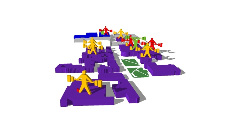
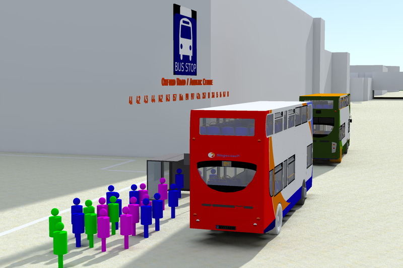
06 - Instead of using balls, simplified models of human are drawn to give a better visualisation of data. The image shows average number of people waiting at the bus stop, getting on and off the bus.
Posted 14 May 2014 14:39
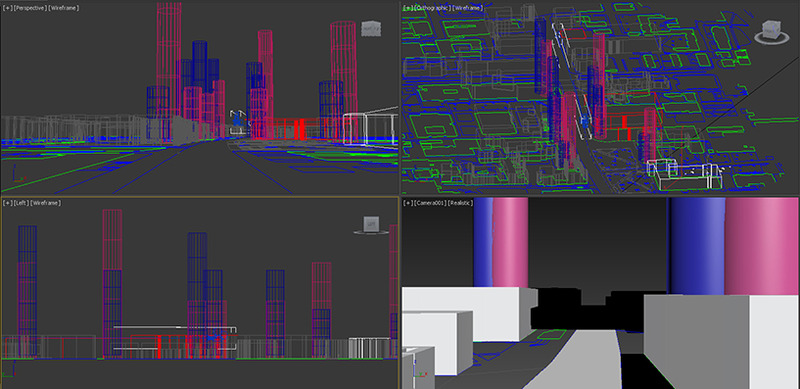
05 - Data in form of Sketchup models are rendered to give a better visualisation. The image illustrates the traffic congestion along Oxford Road.
Posted 14 May 2014 14:37
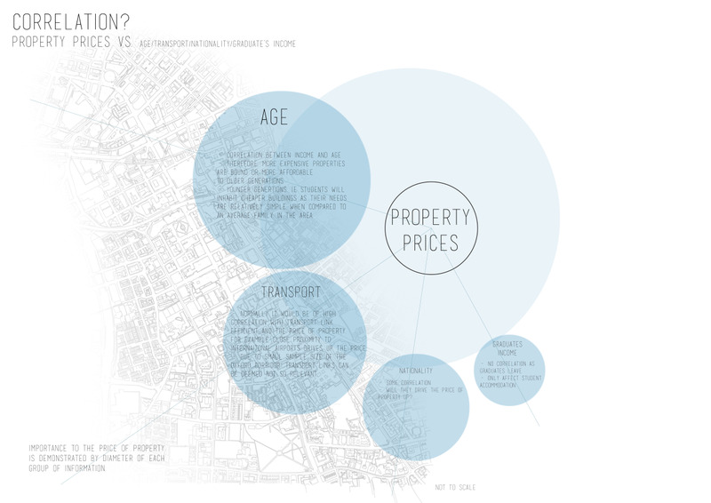
We made a diagram showing the relationship between our groups data (that of graduate's salary income) and with the other 4 groups to try and understand how that might link to the app.
Posted 14 May 2014 13:49
Importing our 3d Sketchup model into 3ds Max to make a video of the ocford road strip with our mapping. The diagrams represent the gender ratio of the courses in within both universities.
Posted 14 May 2014 13:45
Working once again with Ullyses, we undertook a workshop which developed our understanding of what makes a 'game', so that this analysis could influence the final output of the Event.
Posted 14 May 2014 12:28
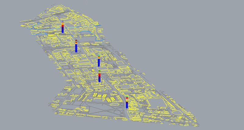
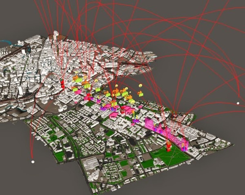
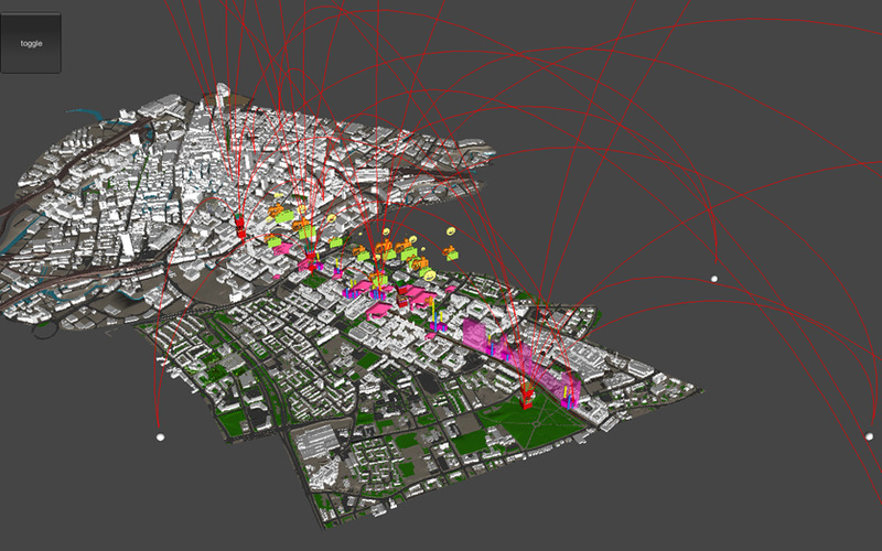
After meeting with our collaborator, Eric from Arup, we began to be able to see what our mapped data would look live visualised and geolocated within a 3D model of the Oxford Road corridor.
Posted 14 May 2014 12:27
13/05/2014
C# coding on unity of our project.
Posted 14 May 2014 11:21
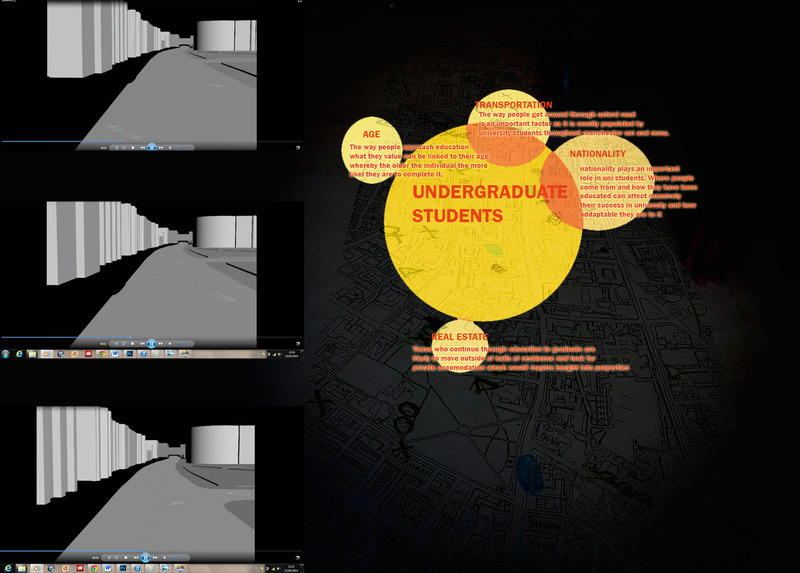
04: Groups now present how there data collection can be visualized in 3D
Posted 14 May 2014 10:50
First look at our app, showing the linked data over the 3-D model of Mnachester.
Posted 14 May 2014 09:56
Day 5 - We then began to work out the relationship between the different groups data. Collaborating this data allowed us to see which information overlapped. This map was then used to begin the programming of the app.
Posted 14 May 2014 09:52
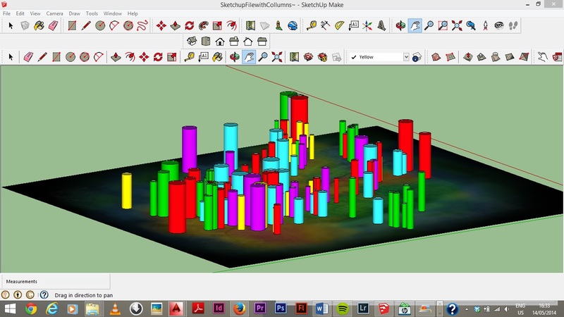
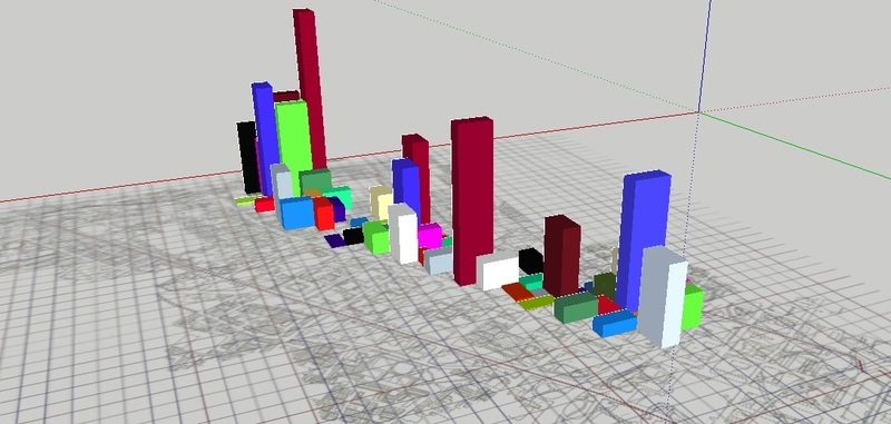
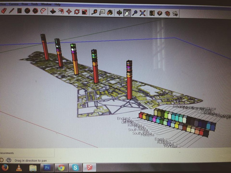
Day 4 - With our data we then tried to represent this in a 3-D way visually using a Google SketchUp model. With different colours representing different age groups, the height of the towers represent the density of that particular age in that district.
Posted 14 May 2014 09:43
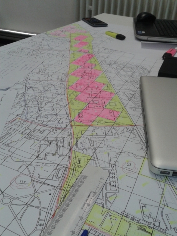
Day 3 - To then calculate the density of people in the sub districts we created a grid system which was placed over a map of Oxford Road. We worked out the hectare area for each individual district with the grid system. We could then, using a calculated estimation, work out the density of each age group in different areas.
Posted 14 May 2014 09:32
Day 2 - After finding data we then needed to relate this to a map. To make our data smaller and more accurate we divided the four different wards we were looking at and had data for, into their sub districts.
Posted 14 May 2014 09:21
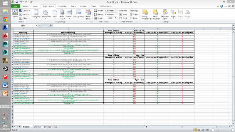
Bus Stop Data accumulate from a numbers of surveys.
Posted 14 May 2014 00:52
13/05/2014
With our data maps being coded, each individual group focused on how the different data sets possibly correlate between one another.
Posted 13 May 2014 22:46
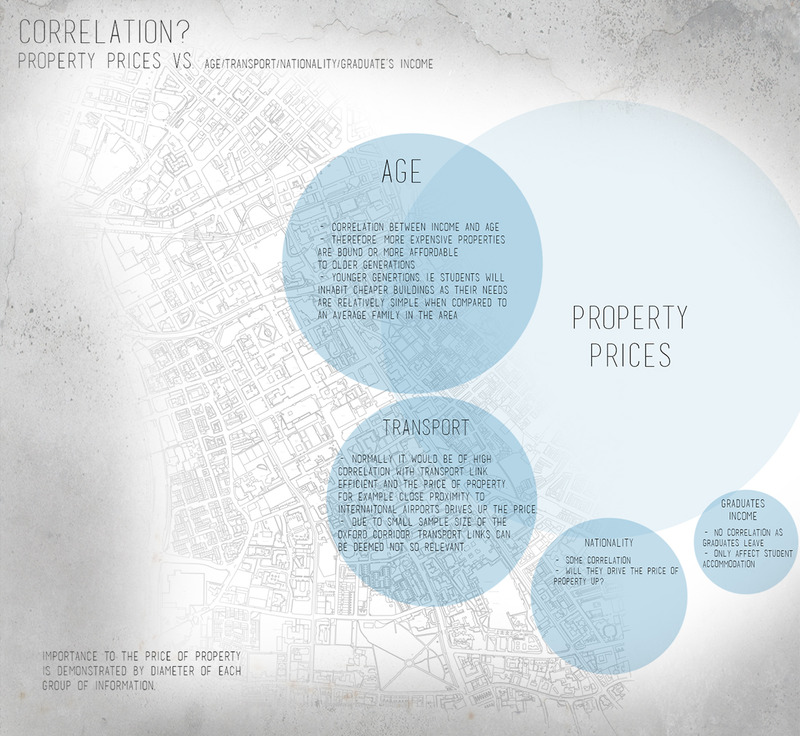
Correlation diagram between Property pricing and the other groups.
Posted 13 May 2014 22:28
C# Coding on Unity.
Posted 13 May 2014 22:25