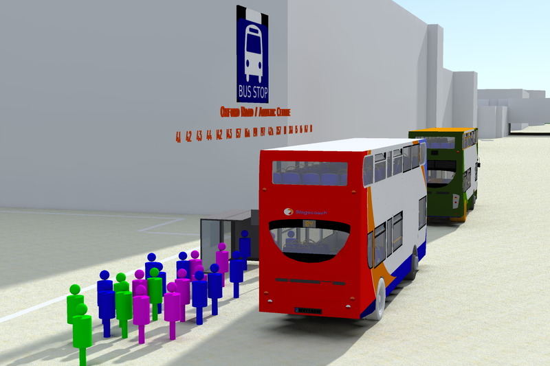
06 - Instead of using balls, simplified models of human are drawn to give a better visualisation of data. The image shows average number of people waiting at the bus stop, getting on and off the bus.
Posted 14 May 2014 14:39
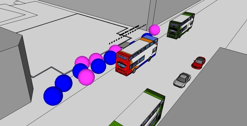
05 - Data in form of Sketchup models are rendered to give a better visualisation. The image illustrates the traffic congestion along Oxford Road.
Posted 14 May 2014 14:37
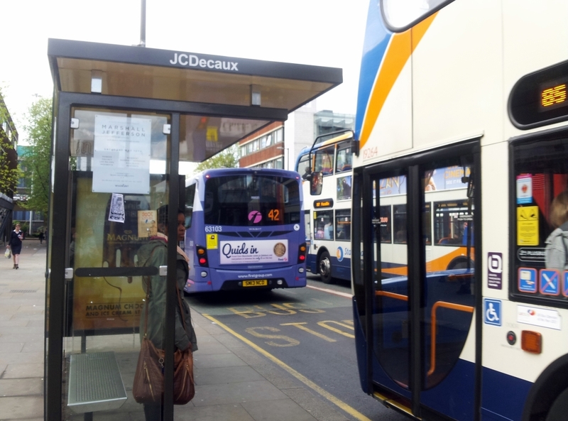
04 - Information and data collected are transformed into 3d; the image shows the average number of people getting on and off the bus at Aquactic Centre's bus stop on Oxford Road) . For the following week, we have to produce 3D visualisations of traffic flow (direction+speed), congestion (measure number), bus/car (colour-coded), buildings, bus stops, regions, etc.
Posted 9 May 2014 16:24
03 - Collecting data on site.
Posted 8 May 2014 22:00
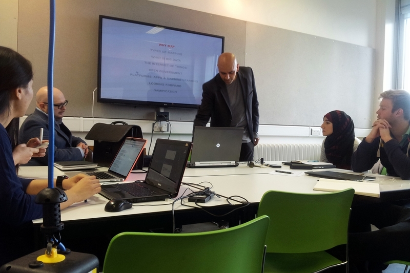
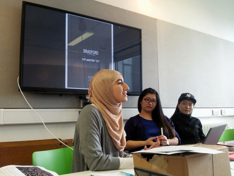
02 - A lecture on mapping and big data is given by Ulysses Sengupta, followed by group presentation on the data collected. Our group focuses on transportation.
Posted 8 May 2014 21:54
01 - Introduction to the event (Data City), conducted by our seniors. We are divided into 5 teams to do research and collect data on different topics from Oxford Road.
Posted 8 May 2014 21:47