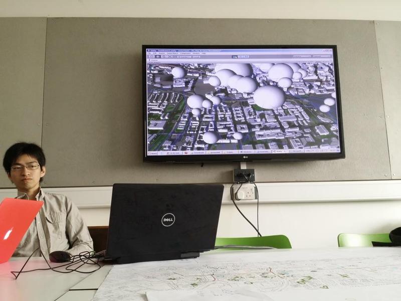
After supplying Eric with our data (property pricing) the pervious day, we had the first visual of the final application the next day with the data represented in 3d- images. Different sizes of spheres on the image represents different property worth.
Posted 16 May 2014 17:00
12/05/14
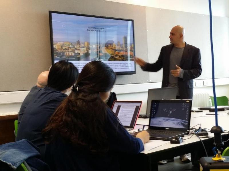
Eric, our collaborator from Arup, showing us some projects.
Posted 16 May 2014 16:46
12/05/2014
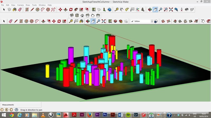
Another method of representing the data collected in 3d using Photoshop and Sketchup.
Posted 14 May 2014 16:47
08/06/2014
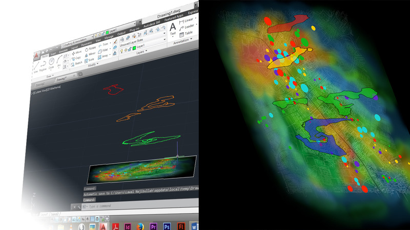
Making the heat map in 3d would make it more visually appealing .Tracing out the outline of the heat map to see how the contours could be generated and then merged together with the heat map to give a final image.
Posted 14 May 2014 16:14
07/06/2014
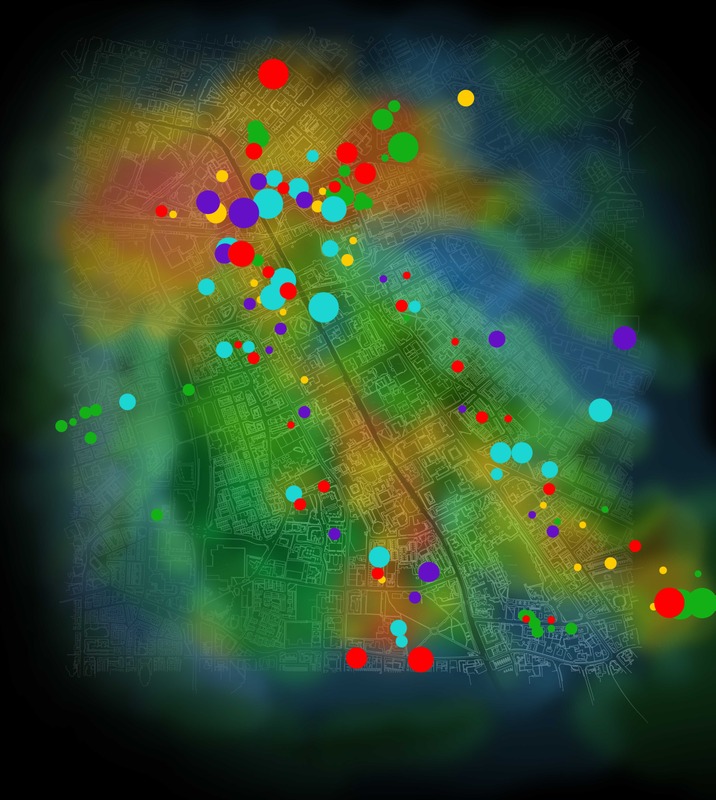
This is a representation of properties (the dots) overlaid with a heat map showing wealth along the corridor. The size of the dot represents the property worth, and the colour of the dot represents the year it was sold.
Posted 14 May 2014 15:58
05/06/2014
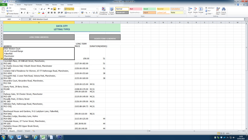
My group was focusing on property pricing in real estate. I was handling letting types. I gathered data and now transferring them into excel sheets.
Posted 14 May 2014 15:38
05/06/2014
The first session was mainly introductions. Ulysses Sengupta gave a lecture on the concept of mapping and big data. We were then split into groups and asked to decide what type of data we were interested in gathering that would be used to create a final app.
Posted 14 May 2014 14:50