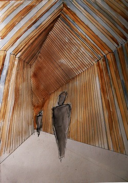
Shou Sugi Ban This is a Japanese method for burning the outside of the wood to give it a unique black appearance. The black colour makes a strong contrast with the orange paint making it stand out even more. As well as this, the method of burning the timber helps to preserve it, lowing maintenance costs for the future.
Posted 15 May 2014 13:11
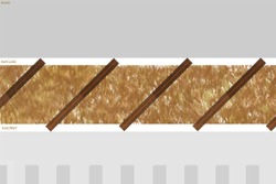
As shown in plan the frames would be rotated at an angle of 45° to optimise the space given on the site. If the frames were perpendicular to the site there would be less than 3m worth of space but by rotating them you can get frames with a width of 4.25m. The other advantage of rotating the frames is that they open up to the public, allowing easier access into the pavilion.
Posted 15 May 2014 13:09
This is an elevation as seen from the South, the train side. We have added orange colouration to the outside, to make it more interactive for the train passengers. The colours shift from light to dark to light, which would make a fascinating illusion whilst travelling at over 100mph on the train.
Posted 15 May 2014 13:07
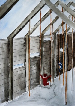
Through perspectives we were able to show some of the finer details of our initial ideas. For example lighting at night, initially we thought lighting top of the frames directed downwards would be suitable however it did not light up the shape of frames. So ground lighting directed up would be more suitable in this case as it would make the pavilion visible and safe at night. Another positive from using lighting on the ground is we could take advantage of solar powered lights, making them self sufficient, reducing the annual energy cost. We also looked into adding foliage to the tops of the frames, this makes them look more natural but the maintenance could be costly. The biggest positive from the perspectives is how it shows the rhythm of the frames and how they enclose the space.
Posted 15 May 2014 13:05
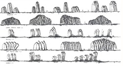
The initial idea was to create a repetitive frame that would span the distance of the site with the key idea of function, aesthetics and cost in mind. So through sketching we experimented with different forms that the frames could be in, whilst thinking about how they could be used by the public. The third row of sketches shows the first idea of having the narrow pointed frames with multiple functions; pavilion, open/closed playing area, seating and herb gardens.
Posted 15 May 2014 13:03
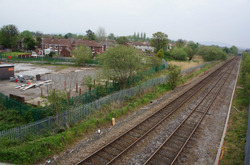
Our brief was set by the New Charter Housing Group, who own 20,000 properties mostly around the Aston area. These properties are mainly council housing but also include privately owned retail, care and education buildings. As a group we were given the task to fill a plot of land that is roughly 3m x 200m, adjacent to a housing estate that is being built this year.
Posted 15 May 2014 13:01
